Website with adaptive design
Why is an adaptive website better than a mobile version or an application?
According to the IDS, a corporation that analyses the web, the sales of smartphones will rise by 32.7% during 2013 when compared with the previous year and in 2013 it stands at 958 800 000 devices in comparison with the previous year when only 733 400 000 devices were sold. At the same time during the current year we will reach a new milestone – the sales of smart devices represents 52.2% from the sales on the global market for mobile devices, and for the first time in history these sales are ahead of the sales of ordinary cellphones. In future this trend will lead to a substantial rise in mobile data traffic, according to the IDS’s experts.
As claimed by the publication The Economist, which quotes analysts from the investment branch of the Morgan Stanley bank, during the year 2013 the number of mobile devices connected to the web finally went beyond the number of personal computers connected to the Internet. But thanks to the fact that the mobile connectivity is expensive, the volume of this traffic is not as high as the traffic generated by stationary devices, although the findings indicate steady and constant rise.
The statistics company StatCounter quoted its figures for June of 2013 – more than 16% of the world’s traffic comes from mobile devices in contrast to the 10.4% during June of 2012. As far as Bulgaria is concerned, these figures are lower – 5.62% of the mobile traffic when compared with the stationary traffic. What should be noted is that StatCounter considers only smartphones and telephones – tablets and mobile computers are not included in its statistics. This means that the volume of mobile traffic, in the traditional sense of the word, is even higher.
Adaptive website, mobile version or an application?
How should the online shop be presented before mobile auditorium? Presently there are only three possibilities: the creation of a mobile version of the website, the development of a special application or redesigning the site using adaptive technology.
The mobile version is perhaps the easiest and fastest way, but in the same time it is also the less effective. A webpage on mobile version only looks good on a single type of device, for example smartphones with resolution 480 * 320, but it does not render correctly on other types of devices.
The application allows you to incorporate a full range of functions, integrate them into the device better, and it also makes the interface more intuitive. The problem lies in the fact that for each platform, IOS, Android, WordPress and so on, is necessary for a separate application to be created, which leads to a higher cost for its development and more difficult maintenance (upgrades, the removal of errors), additional efforts that ask for extra time and finances.
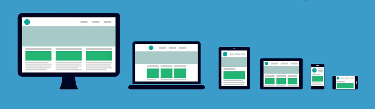
A website developed with adaptive design is a single website, which displays differently on each type of device taking into account the size of the display and preserving the functionality and the website’s content. It is enough to develop adaptive web design once, and there will be no need to undergo this process again.
Webpages will display equally well both on existing and future devices, which are expected to make their debut on the market. Apart from all this, there exist methods for a website to be transformed for certain devices and to adopt the look of a mobile application, without actually being such an application. It looks like that an adaptive website is by far the best choice – it increases the conversion, the revenue for the online shop’s owner and makes the clients happier.
Main principles of adaptive web design
How the adaptive web design works? Irrespective of what type of device is used to access the content of a website, the first thing required is to determine the correct size of the screen and to determine whether the device is stationary or mobile. Depending on the data received for the display is generated a version, adapted towards the current resolution. The so-called breakpoints are also being used. They take into account the most common screen resolutions – 320, 480, 600, 768, 1024 and 1280 pixels. Depending on which control point is closer to the size of the screen, the design of the webpage is reconstructed – the grid is being transformed, together with the components, fonts and advertising space it contains. As it is the case with the smartphones, in order to save time and traffic, only small versions of the page and previews will be generated, while the large screen of a laptop will display large graphics, suitable for Retina displays.
The technical level of the modern devices allows for the adoption of the Progressive Enhancement conception. Most tablets and smartphones have accelerometer, which can be used for interactive communication with the websites. The user shakes his device and it removes the data from the last field in a purchase order or displays banner or graphic. Take for example a GPS module – if it is active, the website automatically displays for a user a list with shops and commercial sites in the vicinity. The only restriction here is the fantasy of the developer. The Progressive Enhancement is an extra, made available to owners of modern devices, but this does not reduce the functionality of the website for technically not so sophisticated devices.
To develop an adaptive website is possible for all types of online shops. There are only a few rare instances where the content management system of a website places certain restrictions. Therefore it is easier and more productive for an adaptive web design to be created in parallel with the development of the website.
Those who prefer to adopt a mobile version of the website must take into account a number of issues. Modern mobile browsers no longer support the once popular Flash technology. It is about the right time you abandon this technology and consider the faster and more advanced HTML5 and CSS3, which are well supported in all modern smartphones and tablets.
Another important aspect is the format of the order. The fields necessary to be filled in the mobile version is a good idea to be reduced to maximum two – name and a telephone number will be enough. It is not convenient to write long texts on touchscreen.
Furthermore, in adaptive web design the form and place where advertisements appear vary, and this must also be taken into account. For example, large popup windows reduce the visibility of a webpage on compact screens which leads to bad user experience. The best way in which to conduct mobile advertisement is not yet discovered.
The development of a website with adaptive design is a more expensive undertaking, but it is much more than the mobile version of your online shop. There is no place for compromises. Through the use of adaptive technologies for design, the functionality of the website does not suffer. If fact it is quite the opposite – it becomes better with the constant improvement and allows the client to use new functions unavailable on a desktop device.
An advice for those who wish to save money: Don’t consider which alternative is cheaper – a mobile version, an adaptive web design or an application. If you think in this way, you may miss out on what you really need. It is better to accumulate a large budget for a series of not so large but well-though experiments. This will allow you to transition to a better conversion for you website, one step at a time.